Sec.1-Ch.1-Subsec.4:Getting Started with Pharmaceutical Data Science,Understanding Data Visualization
A practical, beginner-friendly guide to understanding medical data visualization using ggplot2 and Shiny

In the world of data science, the old saying “a picture is worth a thousand words” still holds true. Data visualization is not just about turning numbers into charts—it’s a powerful way to uncover hidden patterns, trends, and anomalies in data. R is one of the most widely used programming languages in data science, especially known for its strong visualization capabilities. That’s why many data scientists and analysts choose R as their go-to tool. In this article, through detailed examples and hands-on code, we’ll walk through R’s data visualization capabilities and explain why R is such a smart choice for visualization tasks.
1. Data Visualization
At its core, data is a symbolic record of real-world events that can be identified and interpreted. It captures attributes, states, and relationships between objects. Extracting meaningful information from data, however, is a major challenge.
In the medical field, the collection and mining of secure and interoperable clinical datasets are critical for scientific progress, AI model training, drug research, scientific discovery, business analytics, and precision medicine. As data analysis becomes more central, medical devices are becoming more common, and patient-specific data—along with the analytics built on top of it—has become a primary revenue source for digital health companies.
Market demand and improved data utilization capabilities have fueled the growth of the healthcare data market. This has strengthened the connection between health data and medical researchers, accelerating medical research and scientific breakthroughs.
Why Data Visualization Matters
In this process, data visualization is indispensable. It transforms complex clinical datasets into intuitive charts and graphics, making relationships and trends easier to see. By leveraging the human visual system, visualization helps us process large volumes of data, spot patterns, and improve overall data efficiency.
In clinical data analysis, for example, doctors can quickly see patient health trends, treatment effects, and potential risk factors. A simple line chart showing physiological indicators over time can immediately reveal changes in a patient’s condition. In short, data visualization allows clinicians and researchers to quickly understand complex medical data and make better medical decisions.
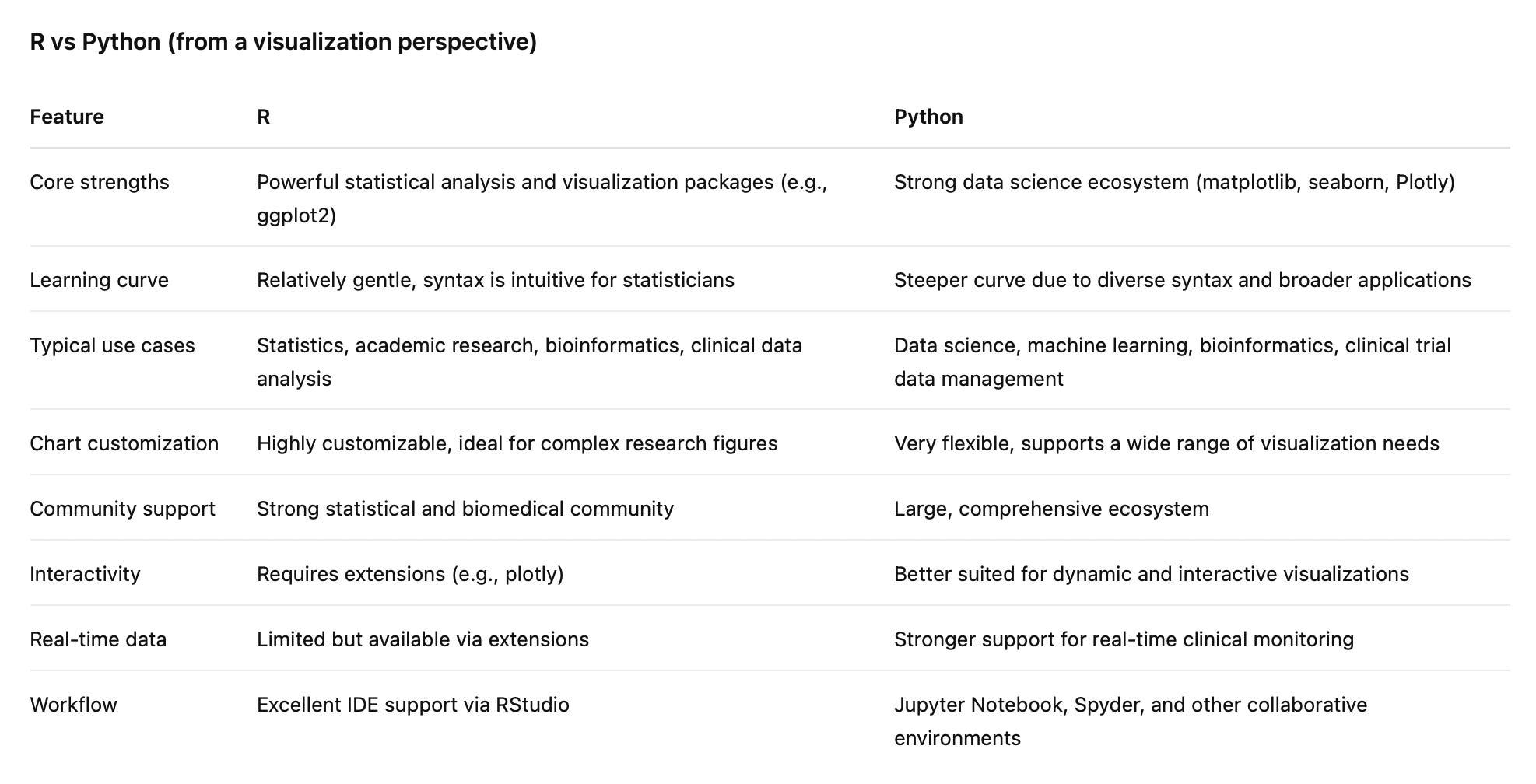
R as a Data Visualization Tool
R is one of the most commonly used tools for data visualization today. With extension packages such as ggplot2, recharts, shiny, and plotly, users can rapidly build models, adjust them dynamically as data changes, and generate a wide variety of common chart types.